-
Mobile: +86 153 0260 4534
-
Address: Guangzhou Pacific Industrial Processing Zone











Restaurant Signage Guide: Exterior Signs, Menus and LED Neon
Restaurant signage should do three jobs: make the location easy to find, make ordering easier, and make the space memorable. This guide explains how to specify exterior letters, illuminated menus, and LED neon without wasting money on signs that photograph well but perform badly.

Signs sell quietly.
A restaurant can spend heavily on kitchen equipment, interior finishes, photography, furniture, and online advertising, yet lose the first commercial battle outside because its name disappears into glass reflections, its menu looks improvised, and its neon feature competes with the logo instead of supporting it.
Why finance the entire customer experience and neglect the first ten seconds?
I treat restaurant signage as a working sales system, not decoration. The exterior sign identifies the business. The menu reduces hesitation. Interior signage directs customers. LED neon creates mood and memory. Each element has a different job, and forcing one sign to perform every job usually produces an expensive mess.
The hard truth is simple: customers do not grade signage drawings. They either see the restaurant, understand the offer, and enter—or they keep walking.
Restaurant Signage Is a System, Not a Single Sign
Effective restaurant signage follows the customer journey:
- Recognition: Can a driver or pedestrian identify the restaurant?
- Confirmation: Does the storefront communicate the cuisine, positioning, and entrance?
- Decision: Can customers understand menu categories and prices quickly?
- Navigation: Can they find ordering, pickup, restrooms, and exits?
- Memory: Is there a distinctive visual feature worth remembering or photographing?
A customer approaching at 40 km/h has a different visual problem from a customer standing 2.5 metres from a counter menu. The same typography, brightness, information density, and mounting method cannot serve both situations equally well.
A Villanova University study on illuminated on-premise signage collected 333 usable responses from sign users. More than 80% reported illuminating signs beyond business hours, while businesses less than five years old that expected losses without illuminated signs estimated an average loss of 26.6%. That figure is self-reported perception, not audited sales data, but dismissing it would still be foolish: operators consistently believe visible illuminated identification affects location awareness, brand recognition, and revenue.
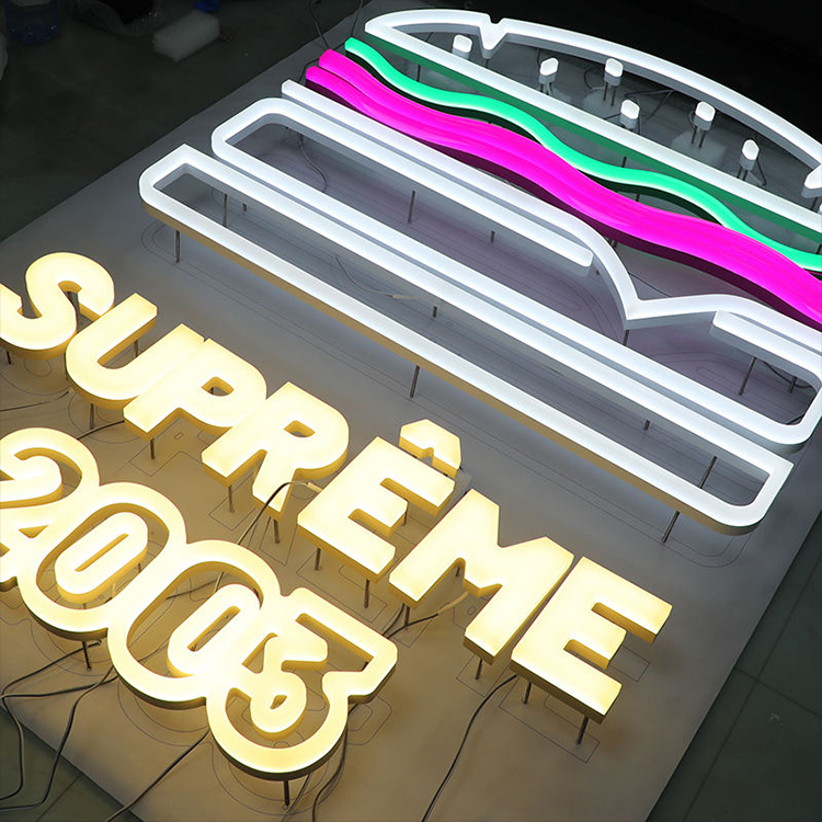
- Restaurant Signage Is a System, Not a Single Sign
- Exterior Restaurant Signs Must Win the Distance Test
- Restaurant Menu Boards Should Reduce Decision Time
- LED Neon Restaurant Signs Need a Defined Job
- Accessibility and Wayfinding Cannot Be Added at the End
- Build a Restaurant Signage Specification That Can Be Reordered
- Common Restaurant Signage Mistakes
- A Practical Restaurant Signage Brief
- FAQs
- Turn the Restaurant Concept Into a Production-Ready Sign Package
The three commercial layers
| Signage layer | Primary job | Typical products | Common failure |
|---|---|---|---|
| Exterior identification | Make the restaurant visible and recognizable | Front-lit letters, halo-lit letters, projecting signs, logo cabinets | Beautiful logo, unreadable at distance |
| Menu communication | Help customers understand and order | Printed menus, slim light boxes, digital menu boards | Too many items, tiny prices, constant visual movement |
| Interior atmosphere | Strengthen memory and brand personality | LED neon, wall logos, directional signs, pickup signs | Decorative feature overpowers the actual brand |
| Operational signage | Reduce confusion and staff interruptions | Order here, pickup, restroom, delivery and exit signs | Inconsistent wording or poor placement |
| Accessibility signage | Identify permanent spaces safely and legally | Tactile room signs, pictograms, high-contrast identifiers | Treated as an afterthought after construction |
I normally judge a restaurant signage proposal by one question: What specific customer behaviour is each sign supposed to produce?
“Look modern” is not a measurable answer.
Exterior Restaurant Signs Must Win the Distance Test
The exterior sign has one unforgiving task: identify the restaurant before the viewer passes it.
For many storefronts, custom LED front-lit letters are the practical starting point because light exits through the letter face, producing direct nighttime visibility. Fonts, logo shapes, acrylic face colours, return depths, trim styles, LED systems, voltages, and mounting methods can be produced around approved project specifications.
Choose the sign type by site conditions
Front-lit channel letters work well when maximum direct visibility is required. They suit shopping strips, roadside restaurants, food courts with façade exposure, and locations surrounded by other illuminated businesses.
Halo-lit letters create reflected light behind the letters. I prefer them for premium restaurants, hotels, restrained hospitality interiors, and dark architectural walls. But a halo needs breathing room. Mount it on rough brick, narrow cladding ribs, or heavily patterned stone and the effect can break into uneven shadows.
Combination front-lit and halo-lit letters provide a stronger visual presence but add wiring, fabrication complexity, and maintenance points. Use the combination because the location needs it—not because the rendering looks expensive.
Projecting signs help pedestrians moving parallel to the storefront. A flat wall sign may be almost invisible to someone walking along the same side of the street.
Cabinet signs and light boxes can carry complex logos and graphics, although badly designed cabinets often become bright rectangles with weak brand recognition.
Size letters from the viewing condition
Do not begin with “How wide is the logo?”
Begin with:
- Furthest useful viewing distance
- Vehicle or pedestrian approach
- Viewing angle
- Typical traffic speed
- Storefront setback
- Nearby visual competition
- Daytime façade contrast
- Nighttime ambient lighting
- Maximum area allowed by local code
Penn State researchers have tested large-format typefaces using recognition-acuity methods and found that font selection affects distance legibility and required sign size. That sounds obvious. It is routinely ignored. A narrow decorative script may occupy the same height as a simple sans-serif letter while remaining far harder to identify from a moving vehicle. Penn State’s research summary on large-format letter legibility is worth reading before approving a stylised wordmark at storefront scale.
My rule is blunt: preserve brand character, but remove details that cannot survive the intended viewing distance.
Contrast beats brightness
More light does not automatically create a more readable restaurant sign.
An overdriven white face can bloom at night, making letter strokes appear swollen and closing small spaces inside letters such as a, e, B, and R. Red letters can lose definition. Cool white can look harsh beside warm architectural lighting. Reflections from curtain-wall glass may reduce contrast even when the sign itself is bright.
Test the sign in at least four conditions:
- Unlit in daylight
- Lit in daylight
- Lit at dusk
- Lit after dark
And test it from the road or pavement—not only from directly in front of the façade.
Specify materials, not vague promises
A serious exterior restaurant-sign specification should identify:
- Letter-face material and thickness
- Return material, depth, and finish
- Back material
- LED manufacturer or approved equivalent
- Power-supply manufacturer and rating
- Operating voltage
- Cable exit positions
- Drainage strategy
- Fasteners and mounting rails
- Corrosion protection
- Service access
- Target colour temperature or emitted colour
- Intended environmental rating
- Approved nighttime brightness
“Waterproof LED sign” is not a specification.
Neither is “premium acrylic.”
For coastal, humid, or chemically aggressive locations, buyers should review aluminum grades, stainless-steel grades such as 304 or 316, coated fasteners, dissimilar-metal contact, drainage, and power-supply placement. An IP rating printed on an LED module does not automatically establish the rating of the completed letter, wiring entry, connector, cabinet, or installed assembly.
Check permits before manufacturing
Sign rules vary by municipality, district, landlord, façade type, and historic status. New York City, for example, states that signs below six square feet that are not illuminated may be exempt from a permit, while larger or illuminated signs remain subject to construction codes, zoning rules, and city regulations. San Diego separately states that installation or alteration of signs on private property generally requires a sign permit. Those examples show why a restaurant chain cannot copy one approval package blindly across jurisdictions.
Freeze the permitted dimensions, projection, illumination method, mounting points, and electrical route before production begins.
Not after the shipment arrives.
Restaurant Menu Boards Should Reduce Decision Time
A menu is not a poster.
It is an ordering interface used by people who may be hungry, distracted, unfamiliar with the restaurant, standing in a queue, reading in a second language, or trying to compare prices while staff wait for an answer.
The best restaurant menu boards create hierarchy:
- Menu category
- Product name
- Short description where needed
- Price
- Modifier or size
- Required nutrition information
- One controlled promotional message
Trying to give every item equal visual importance gives no item importance at all.
Static, illuminated, or digital?
| Menu format | Best application | Advantages | Main risk |
|---|---|---|---|
| Printed board | Small stable menu | Low hardware cost, easy local printing | Uneven lighting and frequent reprints |
| Slim LED light box | Stable or moderately changing menu | Even illumination, clean presentation, replaceable graphics | Poorly designed print remains poorly designed |
| Digital menu board | Frequent price, availability, or daypart changes | Central updates, scheduling, motion and location control | Software, network, screen, and content-management dependence |
| Tabletop menu | Full-service dining | Detailed descriptions and flexible storytelling | Hygiene, reprinting, and inconsistent versions |
| QR menu | Secondary mobile access | Fast updates and multilingual content | Should not be the only accessible ordering route |
For restaurants with stable menus, slim LED menu light boxes offer a low-profile format for replaceable printed graphics. The available range includes wall-mounted, suspended, snap-frame, acrylic, and aluminum configurations, including A2 restaurant menu displays.
I often prefer a well-designed illuminated static menu over an underfunded digital system. A screen does not repair weak hierarchy, inconsistent pricing, poor photography, or unreadable type. It merely displays those failures electronically.
Digital menu boards make sense when operations demand them
Digital restaurant menu boards earn their cost when a business regularly changes:
- Breakfast, lunch, and dinner menus
- Ingredient availability
- Regional pricing
- Limited-time offers
- Delivery and pickup messages
- Languages
- Nutrition information
- Product photography
- Sold-out status
A 2025 Little Caesars rollout moved digital menu management across thousands of restaurants in 16 countries to a central cloud-based content-management system. The project reportedly took less than six months and allowed menus to reflect local pricing, availability, language, and currency. That is a genuine operational case for digital signage—not proof that installing screens automatically increases sales.
The distinction matters.
Central control can reduce obsolete content. It cannot rescue a bad product mix.
Menu-labeling rules can affect the design
In the United States, the FDA menu-labeling requirements generally apply to restaurants and similar food establishments operating under the same name with 20 or more locations and substantially similar menu items. Covered businesses must display calories for standard items on menus and menu boards and make additional written nutrition information available on request.
That requirement affects:
- Available text space
- Price and calorie alignment
- Typography
- Screen templates
- Promotional layouts
- Version control
- Local and national menu variants
Do not build the menu template first and squeeze compliance text into the remaining space later.
Design from the queue position
Print the menu at full scale. Mount it at the proposed height. Then stand where the customer actually waits.
Can you read the prices?
Can you distinguish sizes?
Can you identify the five most frequently ordered products?
Can you understand what is included in a combo?
If a customer needs to reach the counter before discovering the core categories, the board is late.
For digital boards, limit movement around pricing and item names. Motion may attract attention, but constant transitions can hide information at the exact moment a customer attempts to read it. Keep essential ordering content persistent.
LED Neon Restaurant Signs Need a Defined Job
LED neon is useful. It is also badly overused.
I would not use decorative neon as the primary exterior identifier for most restaurants unless the letter size, sunlight conditions, mounting environment, local code, and viewing distance clearly support it. Flexible neon is generally better suited to windows, interior feature walls, bars, pickup zones, branded phrases, food icons, and social-media backdrops.
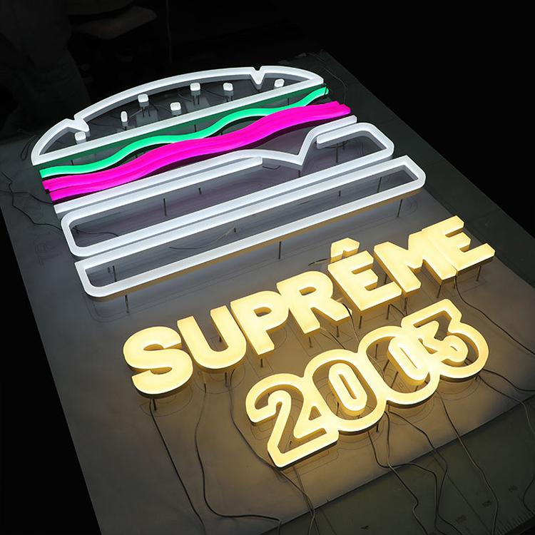
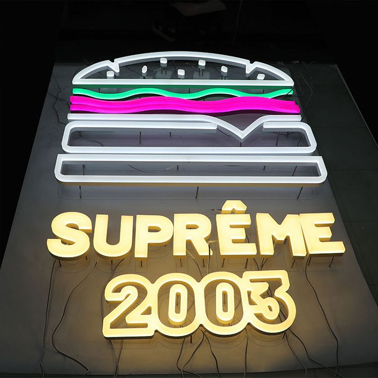
The site’s restaurant and store LED neon sign collection supports custom words, logos, food graphics, colours, backing shapes, mounting directions, voltage arrangements, and installation accessories. That flexibility is valuable, but every additional option creates another approval decision.
Use neon for one of four purposes
A restaurant LED neon sign should normally do one clear job:
- Identify: A logo or compact window identifier
- Direct: “Order Here,” “Pickup,” or an arrow
- Promote: A product category, opening status, or limited message
- Create memory: A photographable phrase, symbol, or branded wall
Do not combine all four in one glowing composition.
Choose colour under real conditions
Warm white around 2700K–3000K suits intimate dining, bakeries, cafés, wine bars, and hospitality interiors. Neutral white around 3500K–4500K feels more controlled and contemporary. Cool white around 5000K–6500K can appear sharp but often looks disconnected from warm restaurant lighting.
Red attracts attention and has strong food-category associations, but excessive brightness can produce visible bloom. Amber works well with dark green, charcoal, and navy surfaces yet can disappear against timber or terracotta. Deep blue may look elegant in a rendering and weak on black glass.
The article on choosing LED neon colours for brand signage explains why HEX, RGB, Pantone, CIELAB, silicone colour, LED output, dimming level, wall material, and ambient light cannot be treated as interchangeable specifications.
Approve a physical illuminated sample.
Screens lie politely.
Fixed colour versus RGB
Use a fixed single-colour system for:
- Permanent restaurant logos
- Franchise identification
- Daily operational signs
- Window branding
- Repeat multi-location orders
Use RGB or RGBW only where colour changes serve a documented operating purpose:
- Daypart ambience
- Seasonal campaigns
- Events
- Entertainment spaces
- Temporary promotions
An RGB sign that depends on staff selecting “roughly the right orange” from an app is not brand-controlled signage.
Record controller values, brightness limits, animation settings, power-on defaults, dimming schedules, and replacement procedures.
Specify the unglamorous details
The neon specification should include:
- Neon-flex profile and dimensions
- LED colour or chromaticity target
- 12 V or 24 V operating system
- Power per metre
- Minimum bend limitations
- Acrylic backing colour, shape, and thickness
- Clear, frosted, printed, or mirrored backing
- Cable colour and exit location
- Wall standoffs
- Hanging or direct-mount hardware
- Dimmer or controller
- Indoor or outdoor use
- Power-supply location
- Access for replacement
- Packaging protection
- Approved physical sample reference
The cable route matters.
A carefully photographed neon slogan with a black transformer wire hanging across white tile is not a premium installation. It is unfinished work.
Accessibility and Wayfinding Cannot Be Added at the End
Restaurant signs also identify restrooms, exits, accessible routes, pickup points, private rooms, and permanent spaces.
The 2010 ADA Standards for Accessible Design include requirements for certain signs involving raised characters, Braille, visual characters, mounting position, pictograms, finish, and contrast. Not every menu, logo, or promotional sign requires tactile information, but signs identifying permanent rooms and spaces may fall within accessibility requirements.
This distinction is regularly mishandled.
A glowing restroom arrow is not automatically a compliant restroom identifier. A stylish door sign mounted on the moving door leaf may not satisfy required placement. A digital menu may create problems for customers who cannot see the screen, reach the interface, or use a QR code.
Coordinate accessibility signage with the architect, code consultant, contractor, and local authority before fabrication.
Build a Restaurant Signage Specification That Can Be Reordered
One restaurant can survive informal purchasing.
A chain cannot.
For multi-location projects, every approved sign should have a controlled record containing:
- Sign code or SKU
- Approved artwork revision
- Overall dimensions
- Visible dimensions
- Materials and thicknesses
- Paint or finish reference
- Illuminated colour reference
- LED and power-supply specifications
- Electrical input
- Mounting pattern
- Cable locations
- Packaging method
- Label format
- Spare-parts requirement
- Inspection checklist
- Approved sample photographs
- Master-sample identifier
The OEM and ODM signage manufacturing process is built around drawing review, prototype development, material selection, LED integration, inspection, export packaging, and controlled repeat production. That approach is particularly relevant to restaurant groups that need the twentieth location to match the first without relying on workshop memory.
Prototype the risky parts
A prototype is justified when the project includes:
- A custom logo shape
- A new façade material
- Fine script lettering
- Unusual LED colour
- RGB programming
- Reflective or tinted backing
- Tight installation space
- Outdoor neon
- Multi-part international installation
- A large rollout
The prototype should test construction, light output, colour, wiring, mounting, packaging, and service access. A sample that only proves the logo shape is incomplete.
Order spares intelligently
For repeat restaurant projects, consider holding:
- Matching LED modules or neon sections
- Power supplies
- Controllers
- Acrylic faces
- Printed menu graphics
- Mounting hardware
- Wiring connectors
- Paint or finish references
Replacement components purchased three years later may differ in LED colour, silicone formulation, acrylic transmission, or surface finish. The cheapest spare is the one ordered with the original production batch.
Common Restaurant Signage Mistakes
Buying brightness instead of visibility
Brightness without contrast creates glare. Visibility depends on size, typography, colour contrast, angle, distance, background, and competing light sources.
Treating the menu as a catalogue
Customers do not need every possible modifier at equal scale. Put detailed options at the counter, on a secondary board, or in a printed or digital menu layer.
Using neon as visual noise
One controlled neon feature can become a recognizable asset. Five unrelated neon phrases make the interior look borrowed from a template.
Hiding the entrance
A large logo does not help when customers cannot determine which door to use. Entrance identification, hours, accessibility, pickup instructions, and directional signs should support the façade.
Approving only renderings
Renderings do not show real glare, reflections, paint texture, colour shift, wiring, fasteners, transformer locations, or viewing angles.
Ignoring maintenance access
LEDs, power supplies, menu graphics, screens, and controllers eventually need service. A sign sealed behind permanent joinery may look clean until the first failure.
Manufacturing before permit approval
This is one of the fastest ways to turn an apparently low-cost sign into a double purchase.
A Practical Restaurant Signage Brief
Before requesting quotations, prepare the following information:
Exterior signs
- Storefront elevation
- Sign-band dimensions
- Maximum permitted sign area
- Viewing distances
- Day and night site photographs
- Wall material
- Electrical location
- Logo vector files
- Brand colour references
- Preferred illumination
- Mounting restrictions
Menu boards
- Final menu structure
- Number of items
- Viewing distance
- Mounting height
- Update frequency
- Price-change frequency
- Required nutrition content
- Language variants
- Static or digital preference
- Network and content-management requirements
LED neon
- Exact message or logo
- Intended purpose
- Installation location
- Wall colour and material
- Target dimensions
- Fixed colour, RGB, or RGBW
- Brightness control
- Backing shape
- Cable route
- Indoor or outdoor use
- Mounting method
Rollout information
- Number of locations
- Country and electrical standard
- Required delivery sequence
- Prototype quantity
- Packaging labels
- Installation responsibility
- Replacement-part strategy
- Inspection documentation
- Target opening dates
Vague requests produce vague quotations.
A supplier cannot accurately price “one restaurant sign set” without dimensions, materials, lighting, quantity, mounting, voltage, drawings, and delivery destination.
FAQs
What is the best signage for a restaurant?
The best restaurant signage is a coordinated system that uses a legible illuminated exterior identifier to attract and reassure customers, a clear menu display to reduce ordering friction, and restrained LED neon to create atmosphere or social-media appeal without competing with the primary logo.
For most locations, I would begin with front-lit or halo-lit letters, add an illuminated or digital menu suited to the update frequency, and use neon only where it performs a clear branding, promotional, or directional function.
How large should exterior restaurant signs be?
Exterior restaurant signs should be sized from the real viewing distance, approach angle, traffic speed, façade width, local sign code, and nighttime background rather than from a logo file alone; the final letter height must let a moving or walking customer recognize the name before passing the entrance.
Full-scale print testing and nighttime site review are more reliable than approving dimensions from a desktop rendering. Decorative scripts, compressed fonts, and thin strokes usually require more space than simple letterforms.
Is LED neon suitable for restaurant branding?
LED neon is suitable for restaurant branding when it serves as a controlled secondary feature—such as a logo wall, window message, bar backdrop, or photo point—and when its colour, brightness, power supply, backing, cable route, mounting hardware, and indoor or outdoor rating are specified before production.
For permanent identity, fixed-colour neon is generally easier to reproduce across branches than RGB. Exterior use requires a complete environmental review rather than relying on the rating of one internal component.
What makes a restaurant menu board effective?
A restaurant menu board is effective when customers can identify categories, items, prices, modifiers, and required nutrition information in a few seconds from the actual queue position; strong hierarchy, limited promotional clutter, high contrast, consistent typography, and easy content replacement matter more than animation or screen count.
Use digital boards when prices, availability, promotions, languages, or dayparts change frequently. Use illuminated static boards when content is stable and operational simplicity matters more.
When should restaurant signs be replaced?
Restaurant signs should be replaced or rebuilt when fading, corrosion, water ingress, dark LED sections, unstable colour, outdated prices, unsafe wiring, poor readability, or noncompliant mounting begins to damage trust or increase maintenance risk; cosmetic patching is rarely economical when the cabinet, electrical system, and graphics are all failing.
Inspect illuminated signs periodically at night because partial LED failures, colour differences, hot spots, and shadowing are often less obvious during daylight.
Turn the Restaurant Concept Into a Production-Ready Sign Package
Do not request a generic “restaurant signage price.”
Prepare the logo files, storefront elevation, menu structure, sign dimensions, quantity, illumination method, voltage, mounting surface, installation country, and delivery schedule. Then ask the manufacturer to recommend a documented construction, electrical configuration, prototype plan, inspection process, packaging method, and spare-parts list.
For a project-specific review, submit those details through the custom restaurant signage quotation page. A disciplined brief will produce a more useful quotation—and a far better sign—than a mood board and a deadline.
Comments