Holen Sie sich Ihr individuelles Angebot für Beschilderungen, bevor Sie gehen
Teilen Sie uns bitte die Art Ihres Schildes, die Abmessungen, die Stückzahl, die Materialien, die Beleuchtung, die Spannung, die Befestigungsart und das Lieferland mit. Unser Ingenieurteam wird Ihre Anforderungen prüfen und ein Angebot aus der Produktion mit empfohlenen Spezifikationen und einer geschätzten Produktionsvorlaufzeit erstellen.
Bevor Sie gehen, holen Sie sich ein Angebot vom Hersteller ein
Teilen Sie uns Ihre Zeichnungen, Maße, Materialien, Mengen, Beleuchtungsanforderungen und den Lieferort mit. Unser Team für Beschilderungstechnik wird Ihr Projekt prüfen und Ihnen ein maßgeschneidertes Fertigungsangebot für LED-Buchstaben, Leuchtkästen, Pylonschilder, Tankstellenbeschilderungen oder andere maßgeschneiderte Beschilderungssysteme unterbreiten.
How to Improve Gas Station Visibility From the Road
Drivers decide quickly.
A motorist approaching at 45 or 55 mph is simultaneously watching traffic, checking mirrors, reading prices, identifying the correct driveway, judging whether the station is open, and deciding whether changing lanes is still safe.
How much attention do you think remains for a cluttered sign?
Not much.
This is why I reject the common industry idea that gas station visibility can be solved by making a logo larger or adding more LEDs. Roadside visibility is a timed communication problem. A station must be detected, identified, understood, and entered—in that order.
The sign also has to work from a moving vehicle, through traffic, in direct afternoon sun, at night, during rain, and sometimes behind delivery trucks or roadside vegetation.
My blunt opinion is this: if motorists recognize your station only after they pass the entrance, your gas station signage has failed, regardless of how good it looked in the design rendering.
Gas Station Visibility Is a Time-and-Distance Problem
The first question should not be, “How tall should the pylon be?”
Ask this instead:
Where must a driver first be able to read it?
The Federal Highway Administration has used an estimated static-sign legibility relationship of approximately 30 feet of reading distance for every inch of letter height. In FHWA testing, signs with 10-inch letters were evaluated at 300 feet; 92% of white-message lists and 100% of amber-message lists were read correctly under the study conditions. The research does not create a commercial-sign guarantee, but it gives buyers a defensible calculation rather than a guess. See the FHWA legibility testing results.
Using that 30-feet-per-inch relationship, we can estimate the theoretical reading window available to an approaching driver.
Letter or Digit Height
Estimated Legibility Distance
Reading Time at 45 mph
Reading Time at 55 mph
8 inches
240 feet
3.6 seconds
3.0 seconds
12 inches
360 feet
5.5 seconds
4.5 seconds
18 inches
540 feet
8.2 seconds
6.7 seconds
24 inches
720 feet
10.9 seconds
8.9 seconds
These figures are theoretical starting points. Actual gas station visibility may be reduced by:
Curves and elevation changes
Trees, utility poles, traffic signals, and neighboring signs
Trucks or buses blocking the lower part of the sign
A sign face that is angled away from approaching traffic
Poor foreground-to-background contrast
Glare from acrylic, glass, or polished metal
Small fuel-grade labels placed beside large price digits
Excessive information competing with the station identity
Insufficient daylight brightness
Excessive nighttime brightness that creates bloom or glare
Bigger is not magic.
A 24-inch LED digit hidden behind a box truck is still invisible. And a tall pylon turned at the wrong angle can perform worse than a shorter double-faced structure designed around both traffic approaches.
Penn State transportation research into on-premise commercial signs found that vehicles in front of, beside, or approaching the subject vehicle can block the line of sight to low-mounted roadside signs. That finding supports something experienced sign buyers already suspect: monument-style signs may look architecturally neat while losing visibility in heavy traffic. Review the Penn State study on traffic, mounting position, and sign visibility.
So before specifying steel, aluminum, acrylic, or LEDs, record the actual road geometry.
Build a Visibility Stack, Not One Hero Sign
Gas station visibility rarely depends on one structure. It comes from several signs doing different jobs at different distances.
Trying to place all five jobs on one pylon creates visual congestion. Drivers do not patiently inspect commercial signs. They scan for recognizable information and discard everything else.
Use the Pylon for Early Recognition
A gas station pylon sign should answer three questions fast:
Which station is this?
What is the fuel price?
Where do I enter?
That is enough.
Additional panels for car washes, food brands, loyalty programs, diesel, truck lanes, ATM services, EV charging, propane, and convenience-store promotions may be commercially valuable. But every added message consumes space and attention.
The priority order should normally be:
Petroleum or station identity
Primary fuel price
Secondary fuel grades
Essential service identifier
Entrance or directional cue
Everything else is secondary.
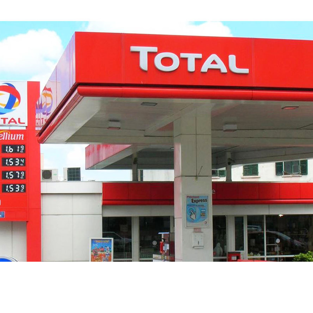
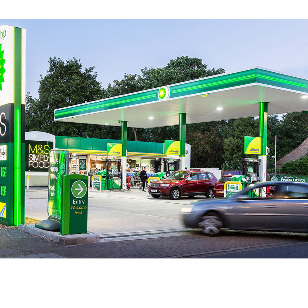
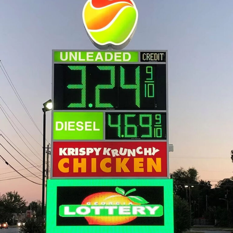
The available gas station pylon sign configurations show how logos, digital prices, service panels, and directional information can be combined. But a product configuration is not a site recommendation. Final height, face angle, viewing sides, structural frame, and price layout must follow an approach survey and local code.
A common mistake is positioning a single sign face parallel to the road because it aligns neatly with the property boundary. From an approaching vehicle, that face may be visible only at a shallow angle. Double-faced pylons typically provide stronger coverage when vehicles approach from opposite directions.
But test it.
Stand where the driver first needs the information, photograph the proposed sign location, and draw the expected viewing angle. Do not approve orientation from an architectural site plan alone.
Make Fuel Prices Readable Before the Turn
Fuel price is not decorative content. It is often the driver’s commercial trigger.
My hard rule is simple: never approve digit size without testing the complete price composition.
The large numeral might be readable while “Regular,” “Diesel,” “Cash,” or “Credit” remains too small to understand. That creates an apparent price without enough qualifying information, which is both commercially risky and potentially subject to local pricing enforcement.
And do not confuse maximum brightness with good visibility. A display must resist direct sunlight during the day and reduce output after dark. Otherwise, digits may disappear at 3 p.m. and bloom into unreadable red shapes at 11 p.m.
Use the Canopy as a Second Recognition Layer
The pylon wins the distant approach. The canopy takes over as the motorist gets closer.
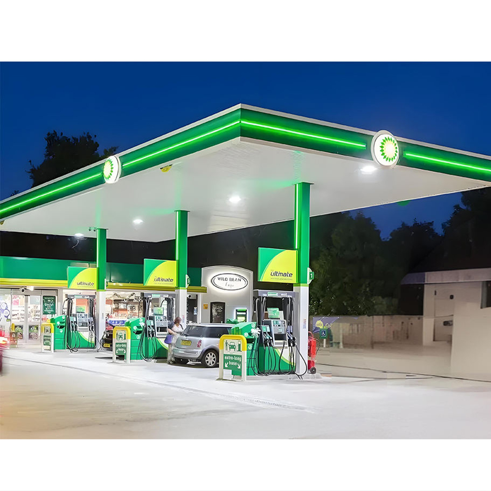
Well-designed gas station canopy fascia signage can make a forecourt recognizable even when the pylon is partly obstructed. Continuous brand bands, illuminated corner details, and correctly scaled logos help drivers confirm that they have found the intended station.
The canopy should not attempt to repeat every price and promotion shown on the roadside sign.
Its work is simpler:
Establish the site boundary
Confirm the station identity
Signal that the forecourt is open
Make the fueling area easy to locate
Maintain a consistent appearance from different road approaches
Uneven lighting destroys that effect. Dark corners, visible LED dots, mismatched color temperatures, warped fascia panels, and random panel joints make the site appear older and less controlled than it may actually be.
That perception matters. Motorists do not inspect the workmanship. They form a quick judgment about cleanliness, safety, and reliability.
Mark the Entrance Before Drivers Reach It
A visible station with an invisible driveway still loses customers.
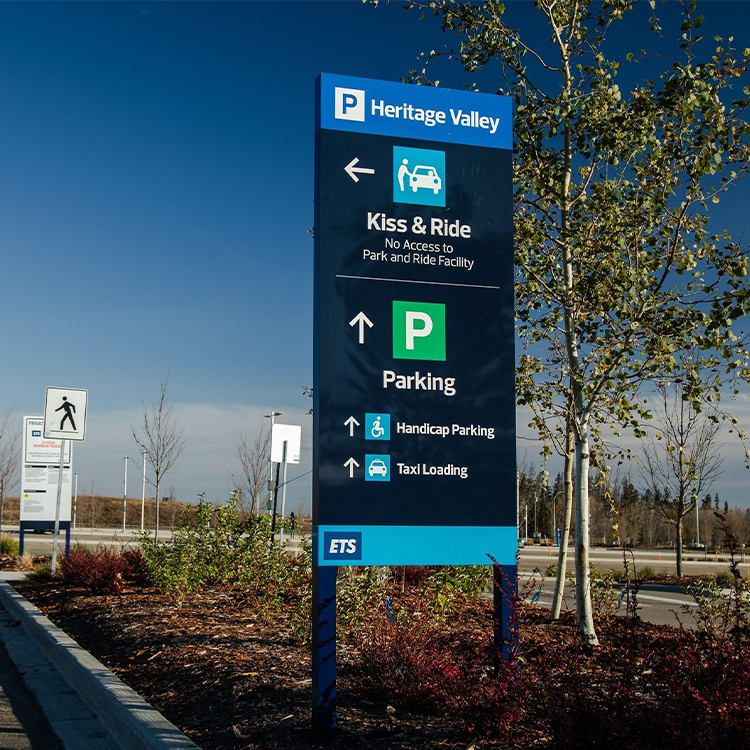
Entrance signs should be separated from promotional content and placed where motorists have time to slow down or change lanes. Use short wording, recognizable arrows, and strong contrast.
“ENTER” and a clear directional arrow will outperform a crowded panel containing:
ENTER
CAR WASH
DIESEL
FOOD MART
ATM
OPEN 24 HOURS
LOYALTY MEMBERS SAVE 5¢
That is not a sign. It is a reading assignment.
And drivers will decline it.
What Makes Roadside Gas Station Signs Readable
Visibility and readability are related, but they are not identical.
A bright object may attract attention without communicating useful information. Conversely, a technically readable message may never attract the driver’s eye.
Good roadside gas station signs must do both.
1. Create a Ruthless Message Hierarchy
I recommend testing the sign by squinting at the rendering until fine details disappear.
What remains?
It should be the logo, primary price, and entrance cue. If promotional copy remains stronger than the station identity, the hierarchy is wrong.
Use no more wording than a driver can process in the available viewing window. A three-second approach is not the place for complete sentences.
Cut words first.
2. Design for Contrast, Not Brand Guidelines Alone
Brand manuals are often prepared for print, websites, uniforms, or close-range retail graphics. They may not address a backlit acrylic face viewed through rain from 400 feet away.
Yellow on white may be on-brand and still fail. Thin white letters on a bright photographic background may look sophisticated on a laptop and disappear outdoors.
For road-facing content, compare:
Gesichts-Make-up für den Tag
Farbe bei nächtlicher Beleuchtung
Letter-to-background contrast
Surrounding sky and building colors
Nearby commercial signs
Reflections from glossy materials
Color shifts through translucent films or acrylic
Approve both illuminated and non-illuminated samples. A Pantone reference does not tell you how a sign will look when light passes through it.
3. Increase Spacing Before Adding More Copy
Large letters squeezed together can read worse than slightly smaller letters with proper spacing.
Price rows need enough separation to prevent one line from visually merging with another. Fuel-grade labels should not touch the digits. Logo panels require clear space around the identity.
White space is productive.
It gives the eye somewhere to separate one message from the next.
4. Account for Traffic Obstruction
Run the visibility test when the road is busy, not at 6 a.m. when every lane is empty.
Record the proposed sign position while standing or driving in:
The nearest lane
The far lane
The left-turn lane
The opposite traffic direction
A position behind a truck or SUV
The point where lane changing becomes difficult
A low sign may remain visible from the engineer’s camera position on the sidewalk while disappearing completely from a sedan in moving traffic.
5. Control Day and Night Illumination Separately
Direct sun is one test. Darkness is another.
Daytime visibility requires adequate luminance and contrast. Nighttime visibility requires controlled output, uniform illumination, and freedom from glare.
Specify automatic dimming or scheduled brightness settings for LED fuel-price displays. Then require commissioning records showing the final settings.
Do not let the installer leave every display at maximum output because “brighter looks better.”
It often does not.
6. Maintain the Complete Sightline
Overgrown landscaping, promotional flags, temporary banners, parked delivery vehicles, dirty sign faces, faded vinyl, and failed LED modules can gradually destroy visibility after installation.
Sometimes the cheapest visibility improvement is not a new sign.
It is removing a tree branch, relocating a banner, washing an acrylic face, replacing failed modules, or moving a dumpster enclosure that blocks the entrance marker.
A Roadside Visibility Audit That Exposes Bad Design
My review method begins with approach footage, not a polished 3D rendering.
Use this field process before approving new gas station signage:
Step 1: Record Every Traffic Approach
Drive each relevant approach at the normal traffic speed. Use a passenger to record continuous video safely.
Capture daytime, dusk, and full darkness where practical.
Step 2: Identify the Recognition Point
Mark the first location where the station itself becomes visible.
This is not necessarily where the logo becomes readable. It may be where the canopy, pylon silhouette, or site lighting first attracts attention.
Step 3: Identify the Reading Point
Mark where the brand and fuel price can actually be understood.
Record the approximate distance to the proposed sign.
Step 4: Identify the Decision Point
Mark the last location where a motorist can comfortably change lanes, slow down, or enter the driveway without an abrupt maneuver.
This is the real deadline.
A message that becomes readable after this point has little commercial value.
Step 5: Map Every Obstruction
Record trees, poles, public traffic signs, utility cabinets, neighboring pylons, medians, parked vehicles, bus stops, and road curvature.
Check seasonal vegetation too. A winter sightline can disappear when trees regain their leaves.
Step 6: Test Alternative Sign Heights
Overlay several proposed pylon heights on the approach photographs.
Do not assume the tallest option is best. Compare visibility gain against steel weight, wind load, foundation size, freight, crane access, code limits, and maintenance requirements.
Die pylon signs versus monument signs guide provides a useful comparison of long-distance visibility, construction, permitting, and installation considerations.
Step 7: Reduce the Message
Test the design at realistic apparent size, not full screen.
Remove one panel. Then another.
Ask whether the remaining information becomes easier to understand. It usually does.
Step 8: Repeat the Audit After Installation
The finished sign may differ from the approved drawing because of actual foundation position, panel color, LED output, landscape work, or surrounding construction.
Commission visibility in the field. Do not close the project based only on electrical operation.
A sign that lights up is not necessarily a sign that works.
The Permit Trap: A Visible Sign Can Still Be Illegal
Engineering a highly visible pylon does not guarantee permission to install it.
Local regulations may control:
Total sign area
Overall height
Property-line setback
Distance from the public right-of-way
Number of freestanding signs
Electronic-message functions
Brightness or luminance
Animation and change frequency
Landscaping around the base
Structural calculations
Electrical listing
Nonconforming-sign modifications
This becomes especially important during rebranding. Altering an older pylon may trigger a review of its existing legal status, and a project that appears to be a simple refacing job can become a full replacement or variance process.
In Stadt Austin gegen Reagan National Advertising aus Austin, decided on April 21, 2022, the U.S. Supreme Court held that Austin’s on-premises and off-premises distinction was facially content neutral. The practical lesson for gas station operators is not that every local rule is valid; it is that location-based sign classifications remain legally meaningful and can affect modification or digitization plans. Read the Supreme Court opinion on sign classifications.
So perform the code review before releasing fabrication.
Not after.
I have seen too many purchasing plans built around the largest sign a supplier can manufacture rather than the largest sign the jurisdiction will approve. That approach creates redesign fees, delayed openings, wasted engineering, and sometimes unusable fabricated components.
The manufacturer, local sign contractor, property owner, petroleum brand, structural engineer, electrical contractor, and permitting authority should agree on the basic envelope before production begins.
The Visibility Priorities That Usually Produce the Best Return
Not every station needs a new 8-meter pylon or a complete canopy conversion.
Spend first where the visibility chain breaks.
Visibility Failure
Likely Cause
Best First Action
Station cannot be identified early
Pylon too low, obstructed, poorly angled, or absent
Conduct approach survey and compare pylon positions
Brand is visible but price is unreadable
Digits or grade labels too small
Calculate required reading distance and simplify price rows
Sign works at night but vanishes in sun
Insufficient daylight output or low contrast
Test luminance, face material, color, and viewing angle
Site is visible but drivers miss entrance
Directional sign is late, small, or cluttered
Move and simplify the entrance marker
Canopy appears dark or closed
Uneven fascia and forecourt illumination
Audit LEDs, power supplies, lenses, and lighting zones
Pylon is blocked in traffic
Low mounting position or roadside obstruction
Raise, relocate, reorient, or use an additional face
Sign appears visually chaotic
Too many messages and competing brand elements
Establish a strict information hierarchy
Visibility declined over time
Dirt, faded faces, vegetation, or failed LEDs
Introduce scheduled cleaning and inspection
Here is the unpopular truth: purchasing more signage is not always the answer.
Better positioning may outperform added area. Larger digits may outperform a taller cabinet. Fewer price rows may outperform a brighter display. A clear entrance arrow may produce more useful action than another promotional panel.
Measure before spending.
How to Improve Gas Station Visibility From the Road
Häufig gestellte Fragen
How can I improve gas station visibility from the road?
Improving gas station visibility means creating a coordinated roadside communication system in which the pylon, fuel-price display, canopy, entrance signs, contrast, illumination, and sightlines give approaching drivers enough time to identify the station, read the offer, locate the driveway, and turn safely.
Begin with approach videos from every traffic direction. Record the recognition point, reading point, and final safe decision point. Then adjust sign position, height, orientation, copy, digit size, brightness, and entrance marking around those observations.
What is the best sign for roadside gas station visibility?
The best roadside gas station sign is usually a properly positioned, double-faced pylon that presents the brand and current fuel prices in a simple hierarchy, uses letters and digits sized for the actual approach speed, remains readable in direct sun and darkness, and complies with the local sign code.
A pylon should still be supported by canopy branding and clear entrance wayfinding. No single structure can compensate for a hidden driveway, poor illumination, or an overloaded message layout.
How tall should a gas station pylon sign be?
A gas station pylon should be tall enough to clear real obstructions and enter the driver’s field of view before the fuel-purchase decision point, but no taller than local code, structural engineering, wind loading, setbacks, neighboring signs, freight limits, crane access, and useful viewing geometry justify.
There is no universal correct height. Compare several elevations using traffic-approach photographs and verify the permit envelope before commissioning structural drawings.
What size should LED gas price digits be?
LED fuel-price digits should be selected by working backward from required reading distance, traffic speed, lane position, display angle, sunlight exposure, number of price rows, and the time needed to recognize the station and make a safe turn, rather than by copying a competitor’s digit size.
Theoretical distance calculations should be followed by full-scale or scaled field testing. Remember that the grade label, cash or credit condition, and fractional price must also remain understandable.
Why is my gas station sign visible at night but not during the day?
A gas station sign can look bright at night yet disappear during the day because nighttime performance depends on controlled darkness, while daytime visibility is challenged by direct sun, sky brightness, reflections, low contrast, dirty faces, shallow viewing angles, automatic dimming errors, and competing commercial signs.
Test the display during the worst sunlight period, not only inside a workshop. Check LED output, face transmission, numeral color, sign angle, photocell operation, and reflections from acrylic or protective covers.
Are pylon signs better than monument signs for gas stations?
Pylon signs are elevated freestanding structures generally selected for longer-distance roadside identification, while monument signs are lower structures that emphasize architectural integration near an entrance but may be more easily blocked by traffic, vegetation, parked vehicles, medians, and other roadside objects.
A monument sign can work on a slower urban road with open sightlines. A pylon is usually the stronger candidate where approach speeds, traffic density, or surrounding obstructions demand earlier recognition.
Turn Visibility Into a Measurable Sign Specification
Do not request a quotation with only a logo and the words “make it highly visible.”
Provide the supplier with:
Site address
Road speed and traffic direction
Approach photographs and videos
Required reading distance
Proposed pylon location
Local height and area limits
Number of viewing faces
Fuel grades and price rows
Preferred digit sizes
Day and night brightness requirements
Canopy dimensions
Entrance and exit positions
Voltage and control requirements
Wind and structural criteria
Installation and maintenance access
Then demand drawings that show exactly how the structure, lighting, price modules, mounting, and message hierarchy will work.
Visibility should be engineered.
Not hoped for.
Share your site plan, traffic-approach images, sign dimensions, fuel-price layout, illumination requirements, and delivery location through the custom signage project inquiry form to develop a gas station signage specification based on actual roadside conditions rather than a generic catalog design.
Custom Signage Factory fertigt Werbeschilder für Schilderhersteller, Bauunternehmen, Händler und Marken mit mehreren Standorten. Mit einer 20.000 m² großen Werkstatt, über 80 Produktionsmitarbeitern, mehr als 50 Maschinen und einer Jahreskapazität von 100.000 Stück produzieren wir LED-Buchstaben, Leuchtkästen, Pylonschilder, Tankstellenbeschilderungen, Leuchtreklamen und maßgeschneiderte OEM-Beschilderungssysteme.