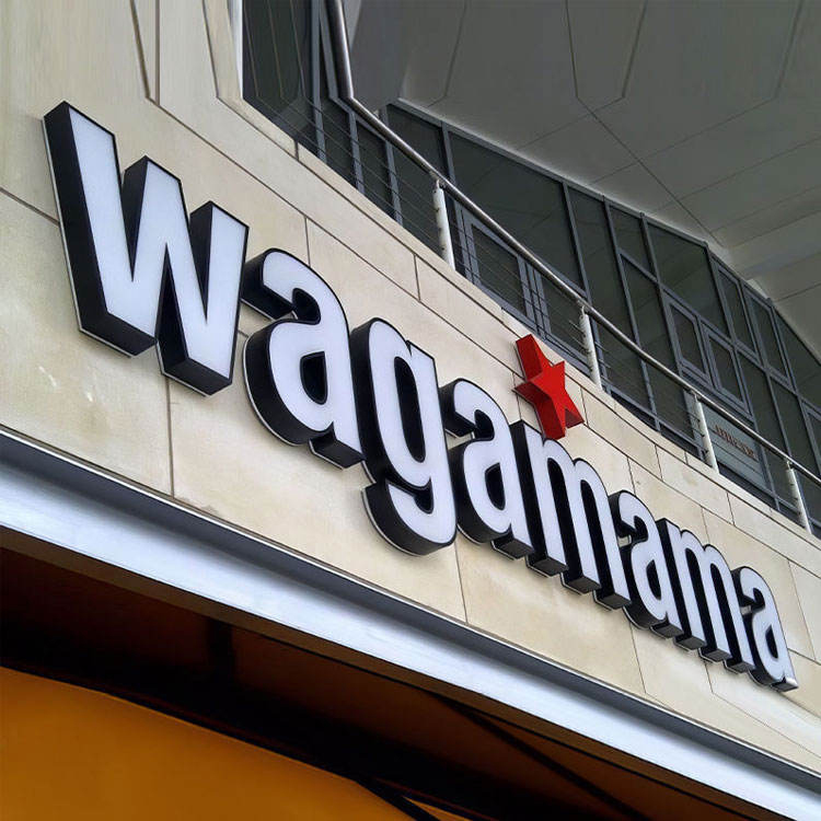
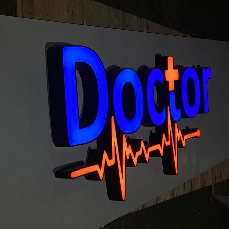
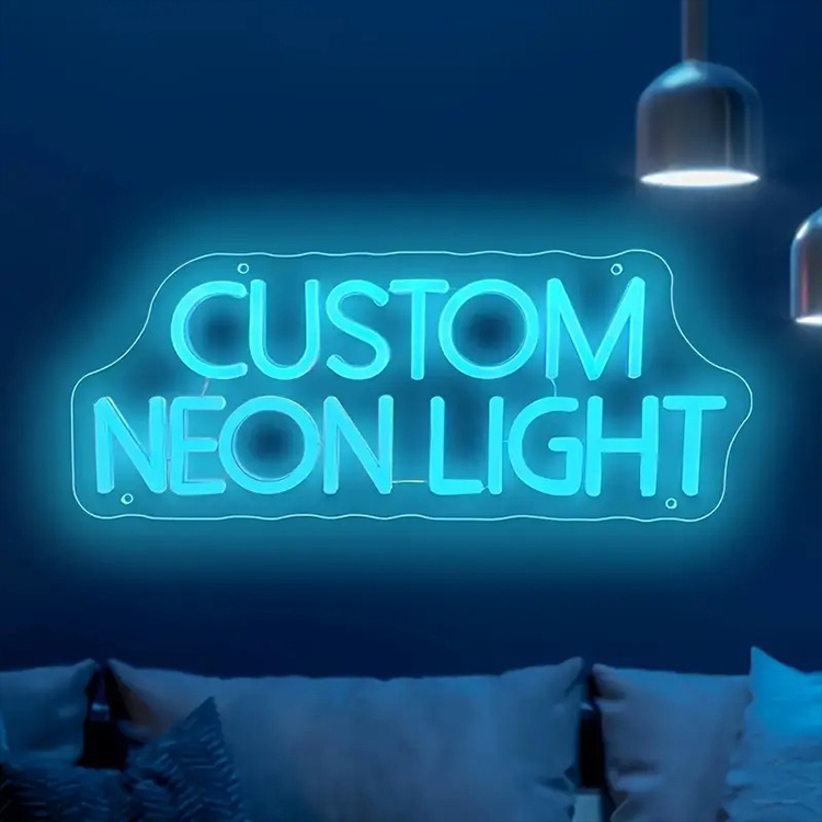
Tell us your sign type, dimensions, quantity, materials, illumination, voltage, mounting method, and delivery country. Our engineering team will review your requirements and prepare a factory quotation with recommended specifications and estimated production lead time.
Before You Leave, Get a Factory Quote
Share your drawings, dimensions, materials, quantities, illumination requirements, and delivery destination. Our signage engineering team will review your project and provide a tailored manufacturing proposal for LED letters, light boxes, pylon signs, gas station signage, or other custom sign systems.
For most illuminated letters, 3000K works best in warm hospitality and luxury environments, 4000K is the safest neutral choice for contemporary commercial signage, and 5000K suits selected high-contrast exterior applications. The correct choice depends on the brand palette, letter construction, wall surface, ambient lighting, viewing distance and required nighttime character.
Color temperature matters.
Although many quotations reduce the decision to a dropdown marked 3000K, 4000K or 6500K, the completed sign also depends on LED binning, acrylic transmission, wall reflectance, module spacing, luminance, dimming and the spectral behavior of every material between the diode and the viewer.
So why do buyers still approve a Kelvin number without requesting a nighttime sample?
The Best CCT Is a Brand Decision, Not a Brightness Setting
Correlated color temperature, or CCT, describes whether nominally white light appears warm, neutral or cool. It is measured in Kelvin, abbreviated as K.
A lower number looks warmer. A higher number looks cooler.
That sounds simple, but the signage industry has turned it into a misleading sales shortcut. Suppliers routinely describe 6500K as “bright white” and 3000K as “soft white,” encouraging buyers to assume that higher Kelvin means more light. It does not.
Brightness is determined by luminous output, drive current, optical losses, acrylic transmission, LED density, letter depth and viewing conditions. Color temperature only describes the general appearance of the white light.
The U.S. Department of Energy’s CCT guidance describes 2700K as friendly and personal, 3000K as warm and pleasing, 3500K as friendly and inviting, and approximately 4100K as clean and efficient. The same guidance warns that a major change from 2700K to 4100K is noticeable and can cause dissatisfaction.
That warning matters for multi-site brands. A retailer cannot install 3000K at one branch, 4000K at another and a blue-tinted “6000–6500K” module at a third location, then claim its nighttime identity is standardized.
A 2021 study involving 113 design students compared environments illuminated at 2700K, approximately 5000K daylight and 6500K. Lower color temperature and daylight conditions received more positive evaluations for spatial quality and social perception than the high-CCT condition. This was an interior-lighting study, not a channel-letter test, but it reinforces an important design point: colder white is not automatically perceived as more attractive or more premium. Review the published study through its DOI record.
My hard rule is straightforward: do not approve the LED Channel Letter Color Temperature until someone has defined what the sign should feel like after dark.
“White” is not a complete specification.
2700K vs 3000K vs 4000K vs 5000K vs 6500K LEDs
The table below gives a practical starting point. It is not a replacement for a sample, photometric review or site test.
Premium appearance without becoming excessively yellow
May lose contrast under very cool surrounding lighting
3500K
Warm-neutral, balanced and approachable
Reception walls, offices, upscale retail and mixed-use developments
Bridges warm architecture and modern branding
Less commonly stocked by low-cost module suppliers
4000K
Neutral white, clean and controlled
Retail stores, corporate offices, dealerships, healthcare and commercial buildings
Versatile, modern and usually compatible with many brand palettes
Can expose green or pink tint when LED binning is poor
5000K
Cool daylight white, sharp and energetic
Selected outdoor signs, industrial sites and blue-white corporate identities
Strong visual separation against dark façades
May look sterile or overly aggressive at pedestrian distance
6000–6500K
Blue-white, cold and highly conspicuous
Limited brand-specific, electronics or high-tech applications
Can reinforce a deliberately icy or technical identity
Often appears cheap, harsh or inconsistent with nearby architecture
2700K: More Decorative Than Universal
A true 2700K system creates a noticeably warm output. It can work beautifully behind brushed brass letters, bronze finishes, timber panels, sandstone, dark marble and heritage façades.
But it is not my default recommendation for white front-lit letters.
When 2700K light passes through opal acrylic, diffusion film, printed color or a thick letter face, the completed sign may shift from “warm white” toward cream or yellow. That may be intentional. Often, it is not.
Use 2700K when warmth is part of the design brief, not when the buyer simply asks for “luxury.”
3000K: The Strongest Choice for Hospitality and Premium Retail
For luxury hotels, restaurants, jewellery boutiques and warm architectural interiors, 3000K is usually the safer premium option.
It creates softness without pushing as far into amber as 2700K. It also pairs well with champagne gold, brushed brass, bronze, copper, timber and beige stone.
For halo-lit and backlit LED letters, 3000K can produce a restrained, floating effect against warm or neutral walls. The result depends heavily on wall reflectance, surface texture and stand-off distance, because the viewer sees reflected light rather than a directly illuminated acrylic face.
The hard truth? Many so-called luxury signs use 6500K modules simply because those modules are cheaper or more readily available. Polished stainless steel plus icy blue-white light is not automatically premium. Frequently, it looks like an appliance showroom.
3500K: The Underrated Compromise
3500K is one of the most useful specifications that buyers rarely request.
It is warmer than the standard office-like appearance of 4000K but cleaner than 3000K. That makes it suitable for reception logos, premium corporate interiors, mixed-material façades and retail spaces where the surrounding architectural lighting falls between warm and neutral white.
The problem is availability. Some manufacturers hold large inventories of 3000K, 4000K and 6500K modules but treat 3500K as a special order. That should not force the wrong design decision.
Ask early.
4000K: The Safest Commercial Default
When the brand brief does not clearly demand warm or cool white, I normally start the discussion at 4000K.
It looks neutral on most modern façades. It is clean without being strongly blue. It also works across retail stores, automotive dealerships, healthcare buildings, offices, shopping centres and contemporary hospitality projects.
For front-lit LED letters, 4000K usually gives white acrylic a controlled commercial appearance while retaining enough visual neutrality to support coloured vinyl, printed graphics or brand-specific face materials.
But 4000K is not automatically consistent.
Two LED products marked 4000K can look different because CCT alone does not fully describe the chromaticity or spectral power distribution. The DOE’s Color and Spectrum research states that CCT becomes more informative when it is paired with distance from the Planckian locus, known as Duv. DOE also demonstrates that different spectral distributions can produce the same nominal 3500K chromaticity.
In plain English: one 4000K module may look clean white, another may look green, and a third may lean pink.
That is why LED brand, bin, Duv tolerance and sample approval matter.
5000K: Useful, but Easy to Misuse
5000K can work for outdoor letters viewed against dark façades, industrial sites, transportation environments, cooler architectural lighting and brands built around blue, silver or technical imagery.
It can also produce stronger perceived crispness than 3000K in certain surroundings.
But perceived crispness is not the same as better branding. At close pedestrian distances, a 5000K face can feel clinical. On polished metal or bright white composite cladding, it may produce an unnecessarily severe visual result.
Before choosing 5000K, compare it with the building’s exterior lighting. A 5000K sign mounted on a façade illuminated by 2700K wall washers will look disconnected, even when both systems are technically “white.”
6000K and 6500K: Stop Calling Them Premium White
6500K has legitimate applications. Electronics brands, ice-themed attractions, selected automotive identities and deliberately futuristic interiors may want a cold blue-white output.
For most hospitality and luxury retail projects, however, it is the wrong default.
The common argument is that 6500K is “brighter.” Again, Kelvin is not a lumen rating. A well-engineered 4000K system can deliver greater measured luminance than a poorly designed 6500K system.
And when 6500K is overdriven behind a white face, the letter edges can bloom, counters can close visually and adjacent surfaces can pick up unwanted blue spill.
More light loses.
Match Color Temperature to the Letter Construction
A Kelvin value cannot be selected in isolation from the sign type. Front-lit, halo-lit and dual-lit systems send light through different materials and toward different surfaces.
The complete collection of custom LED letter signs includes front-lit, backlit, dual-lit and resin-faced constructions. Each type changes how the selected CCT is perceived.
Front-Lit Letters: Judge the Light After the Face Material
Front-lit letters send light through acrylic, resin, polycarbonate, translucent vinyl or a printed face.
That face acts as an optical filter.
A white LED behind red acrylic does not remain visually white. Certain wavelengths pass through while others are absorbed. The final colour depends on the LED spectrum, pigment formulation, acrylic thickness, printing method and internal reflection.
White faces create a different problem. Cheap opal acrylic may introduce a grey, yellow, green or blue cast. Excessive face thickness can reduce output. Insufficient diffusion can reveal individual LED hot spots.
For a serious project, request:
The LED CCT before the face material
The apparent colour after the production face material
Daytime and nighttime sample photographs
An illuminated sample viewed at the intended dimming level
Confirmation that the sample uses the same acrylic, vinyl and printing process as production
Do not approve a bare LED module on a workbench. Approve the completed letter construction.
Halo-Lit Letters: The Wall Becomes Part of the Light Engine
Backlit letters project light toward the mounting surface, where it reflects around the letter and creates a halo.
The colour temperature seen by the viewer is therefore affected by:
Wall colour
Wall reflectance
Surface texture
Letter stand-off distance
LED beam angle
Letter depth
Rear-panel material
Ambient architectural lighting
A 3000K module reflected from a beige wall may appear warmer than expected. The same module on cool grey stone may look muted. A 4000K system on polished white composite can appear very clean, while the same system on black brick may produce a weak and broken halo.
This is why LED backlit letters should be sampled against a surface that resembles the actual façade.
A smooth, light-coloured wall normally produces the most even halo. Rough stone, ribbed metal, dark brick and deep joints require more testing.
Dual-Lit Letters: One Kelvin Value May Not Be Enough
Dual-lit letters send light forward through the face and backward toward the wall.
Those are two different optical jobs.
The face may need coloured illumination for brand recognition, while the halo may need 3000K or 4000K architectural white. Forcing both effects to use the same LED colour and the same control circuit often creates a compromise that satisfies neither function.
The better approach is to specify the face and halo independently:
Dual-Lit Element
Specification Questions
Front face
Brand colour, face luminance, acrylic transmission, diffusion and nighttime readability
Rear halo
CCT, wall reflectance, stand-off distance, halo width and spill control
Electrical system
Separate circuits, dimming range, controller access and service method
Approval method
Full-size sample, test wall and photographs at multiple exposure levels
The site’s guide to front-lit and backlit channel letters explains when two-direction illumination adds genuine value and when it merely increases cost, wiring and service complexity.
For buyers comparing physical products, the front-lit and backlit letter range includes configurations in which face colour, halo colour, letter depth, mounting distance and electrical specifications can be defined separately.
Brightness, Uniformity and Glare Matter More Than Kelvin Marketing
Color temperature cannot rescue a sign that is too dim, too bright or visibly uneven.
A 3000K halo with dark gaps between modules will look defective. A 4000K face with hot spots will look cheap. A 6500K letter driven beyond the comfortable nighttime luminance may become less readable because glare reduces edge definition.
The Federal Highway Administration’s sign-luminance review found that, for the highway sign conditions it examined, approximately 34 to 102 cd/m² was an optimal legend-luminance range and 340 cd/m² was treated as an upper limit. These figures are not commercial channel-letter codes, but they demonstrate a broader optical fact: visibility has a useful range, and maximum output is not always maximum legibility.
Commercial sign requirements vary by municipality, landlord, zoning district, road proximity and operating hours. The supplier should therefore ask whether the project has:
Maximum nighttime luminance limits
Curfew or dimming requirements
Restrictions on flashing or changing colour
Light-trespass limits
Neighbouring residential properties
Heritage or architectural controls
Landlord-approved brand standards
UL, CE or other electrical requirements
The sample also needs to be photographed correctly. Smartphone auto-exposure can make a weak sign look brilliant or make a controlled halo look overexposed.
Ask for several views:
Normal camera exposure showing the building and sign together
Reduced exposure showing letter uniformity and hot spots
Close-up images showing face colour and edge quality
A video demonstrating dimming and any independent circuits
A photograph with a known reference surface or colour card
A glamorous overexposed photograph is not a photometric report.
What Buyers Should Put in the LED Module Specification
The phrase “white LED” should never appear by itself in an approved bill of materials.
A professional illuminated sign specification should include the following.
Target CCT and Acceptable Tolerance
State the target, such as 3000K, 3500K, 4000K or 5000K.
Then state the acceptable range. A nominal 4000K product may be supplied across a broad tolerance unless the buyer controls it.
For sensitive luxury or multi-location projects, also request:
Duv target or acceptable Duv range
Chromaticity bin
Maximum colour variation between modules
Colour consistency between production batches
Replacement-module matching requirements
Luminous Output and Dimming
Specify the required visual performance rather than asking the supplier to install the highest-output module available.
The sign may need:
Full daylight output
Reduced nighttime output
An astronomical timer
A photocell
0–10 V dimming
PWM dimming
Separate face and halo controls
The U.S. Department of Energy reports that residential LED products can use at least 75% less energy and last up to 25 times longer than incandescent lighting. DOE also projects potential U.S. lighting savings of 569 TWh annually by 2035. Those figures demonstrate the wider efficiency potential of LEDs, but they do not guarantee the life of an enclosed channel letter with poor thermal management, low-grade wiring or an overloaded power supply.
Heat still wins eventually.
Face Material, Letter Depth and Module Layout
A module that performs well inside a 150 mm-deep letter may produce hot spots inside a shallow 40 mm resin letter.
Ask the manufacturer to confirm:
Face material and thickness
Letter return depth
Internal finish or reflective coating
Module spacing
Distance from LED to face
Expected light uniformity
Power loading per letter
Maximum power-supply loading percentage
Service access
Environmental and Electrical Conditions
For exterior illuminated letters, document:
Input voltage and frequency
Power-supply brand and model
LED module ingress-protection rating
Power-supply ingress-protection rating
Operating temperature range
Drainage method
Cable-entry sealing
Grounding method
Surge-protection requirements
Installation altitude, where relevant
Local certification requirements
The OEM signage manufacturing service is structured around reviewing dimensions, materials, illumination, voltage, mounting construction and finishes before production. That engineering review is where color temperature should be locked into the approved drawings and bill of materials rather than left as a verbal request.
A Practical CCT Selection Framework by Industry
Luxury Retail
Start with 3000K or 3500K.
Use 3000K with gold, bronze, warm stone and dark timber. Consider 3500K for white marble, silver metal and contemporary neutral interiors.
Avoid 6500K unless the brand manual specifically demands a cold blue-white identity.
Hotels and Hospitality
Use 2700K to 3000K for intimate restaurants, bars, spa entrances and heritage properties. Use 3000K to 3500K for hotel façades, reception logos and premium wayfinding.
Match the sign to the property’s exterior wall washers and entrance lighting. A 4000K sign surrounded by 2700K architectural lighting can look like a replacement part from another building.
Automotive Dealerships
4000K is usually the strongest starting point.
It supports stainless steel, aluminium, glass and clean white façades without introducing the heavy blue tone associated with 6500K. Some technology-led automotive identities may use 5000K, but the actual logo colour should be tested through the approved face material.
Restaurants and Cafés
Choose 2700K to 3000K for warm, intimate and craft-oriented brands. Choose 3500K to 4000K for fast-casual, modern or high-traffic restaurant concepts.
Do not choose a warm CCT solely because food is involved. The sign must still match the brand.
Corporate Offices
3500K and 4000K usually work best.
3500K creates a more welcoming reception environment. 4000K feels more technical and formal. Halo-lit stainless-steel letters often benefit from 3000K to 4000K depending on the wall material.
Healthcare and Professional Services
4000K is generally safer than 3000K or 6500K.
It communicates cleanliness without the cold, institutional appearance that can occur at 6000–6500K. Uniformity and low glare matter more than making the sign appear aggressively bright.
Outdoor Retail and Roadside Locations
Begin with 4000K. Test 5000K when the façade is dark, the surrounding environment is visually busy or the brand palette is built around cool colours.
But measure output. Increase letter size, stroke width and contrast before assuming a colder CCT will solve a visibility problem.
FAQs
What is the best color temperature for illuminated letters?
The best color temperature for illuminated letters is the Kelvin range that keeps the brand recognizable, readable, and visually appropriate in its actual nighttime setting; for most commercial projects, 3000K suits warm premium environments, 4000K provides the safest neutral white, and 5000K suits colder high-contrast applications.
The final decision should also consider face material, wall colour, surrounding lighting, viewing distance, luminance and local sign restrictions.
What is the difference between 3000K and 4000K channel-letter lighting?
The difference between 3000K and 4000K channel-letter lighting is primarily visual tone rather than raw brightness: 3000K produces a warmer, softer white suited to hospitality and luxury finishes, while 4000K creates a cleaner neutral white that usually works better for contemporary retail, offices, healthcare, and automotive branding.
Both can be bright or dim depending on module output, acrylic transmission, LED spacing, letter depth and electrical design.
Is a 6500K LED brighter than a 3000K or 4000K LED?
A 6500K LED is not automatically brighter than a 3000K or 4000K LED because brightness is determined by delivered luminous output, optical efficiency, face transmission, letter depth, LED spacing, drive current, and viewing conditions; 6500K merely appears cooler and may seem sharper against certain dark backgrounds.
Compare measured luminance and completed sign samples instead of choosing by Kelvin alone.
What color temperature is best for halo-lit letters?
The best color temperature for halo-lit letters is usually 2700K to 3000K for warm architectural materials, 3500K to 4000K for neutral modern walls, and 5000K only when the brand or surrounding lighting genuinely needs a cold white effect, because the wall surface becomes part of the optical system.
Always test the halo against a surface that matches the intended wall colour, texture and reflectance.
Does acrylic change the LED color temperature?
Acrylic can change the apparent color temperature of illuminated letters because pigments, diffusion particles, thickness, printed films, vinyl overlays, and internal reflections selectively absorb and redistribute wavelengths, so the LED module’s catalog CCT may not match the color viewers see through the completed letter face at night.
Approve the LED and production face material together rather than evaluating them separately.
What information should I give an illuminated-letter manufacturer?
A manufacturer should receive the target CCT, acceptable tolerance, LED brand or performance class, face material and color, return depth, module spacing, voltage, dimming requirement, wall finish, stand-off distance, daytime and nighttime photos, installation location, and any local brightness restrictions before the illuminated-letter sample is approved.
Vector artwork, brand manuals, architectural elevations and reference photographs will make the quotation and sample more reliable.
Get the Color Right Before the Sign Ships
Do not approve illuminated letters from a Kelvin number, a rendering or an overexposed workshop photograph.
Request a production-representative sample. Review it against the correct wall material. Confirm the LED bin, face construction, halo distance, dimming level and power configuration. Then record every approved detail in the drawings and bill of materials so repeat orders do not drift from one location to the next.
To receive a project-specific recommendation, contact the signage engineering team with your logo file, letter dimensions, quantity, face material, preferred lighting effect, wall photographs, installation voltage and delivery country. The team can review whether 3000K, 4000K, 5000K or a custom lighting configuration is the most defensible choice for your illuminated-letter project.
Custom Signage Factory manufactures commercial signs for sign companies, contractors, distributors, and multi-site brands. With a 20,000 m² workshop, 80+ production workers, 50+ machines, and an annual capacity of 100,000 pieces, we produce LED letters, light boxes, pylon signs, gas station signage, neon signs, and custom OEM sign systems.